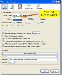
Once upon a time, OK, it wasn’t that long ago, the difference between a toolbar at the top bottom or side of my screen was nothing but a matter of preference. But now, I have a widescreen monitor, and so do lots of other people. In some cases, I need that width for whatever I am doing. Sometimes I work with two applications, or just two windows worth of one application, side by side. Sometimes, usually having something to do with video or graphics, I need all the width for a single application. But, there are A LOT of times when I don’t need all that width to handle my current task. And, when that is the case, I want that toolbar on the side!
 I don’t use Zotero that often. If I got used to it and spent some more time figuring out everything it can do for me, I would probably use it more. But, for now, a notebook and screenshots work pretty well for me. Today, however, I fired up my Zotero Firefox extension and noticed how much of my screen it was hogging there at the bottom. So, I went into the settings to change it to the left or right side of my screen, but that is not an option.
So, now I’m mad and will definitely not be putting any time or effort into learning Zotero until it can do a left or right bar. Or, if that doesn’t happen soon, I might find a replacement first, in which case, I guess I’ll never learn it.
Software developers of all kinds, take these words to heart. We users want ALL the options ALL THE TIME. If you offer top and bottom, then offer the sides, even if it doesn’t make sense to you, or almost no one uses it, because sooner or later, one of us will want it.
Oh, and while you are at it, start developing your products to have a “widescreen” mode. Heck, even the laptops have widescreens these days. The future is now.